Making responsive WordPress Theme Twenty Twelve to support greater resolutions
This is the first article I write about FrontEnd in here, as this is very casual and trivial, and I wanted to specialize the blog in Extreme IT, going deep into knowledge and difficult questions. And in any case, more for BackEnd, Engineering, and Hardware and Operations.
But as it is something useful and myself didn’t found an answer when I googled it, I think is no bad to share it here. Nevertheless I’ll not make it appear in the front page to be loyal to my essence.
So I like Twenty Twelve WP Theme. It’s clear, that’s what I expect from a blog from an Engineer: easy to read. Maybe is to Spartan, but that’s grant.
The instructions to do like me:
- Make a copy of your original Twenty Twelve Theme in another directory, at the same level
- Edit the file /var/www/blog.carlesmateo.com/wp-content/themes/2021-blog-carlesmateo-com/style.css
- Add a new section like this
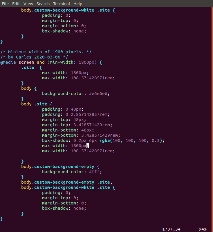
So I defined a new @media screen with min-width of 1800px.
Why 1800px and not 1920px like Full Hd?. Because Ubuntu use some width for the lateral bar.
Then over body .site section I set a max-width: 1800px that will do the trick for some browsers, and the rem value that will do the trick for Chrome.
Now the main section of the block can be correctly displayed using most of the space available.
Rules for writing a Comment